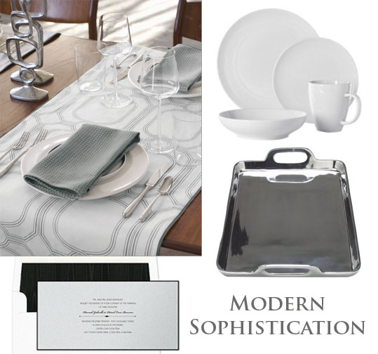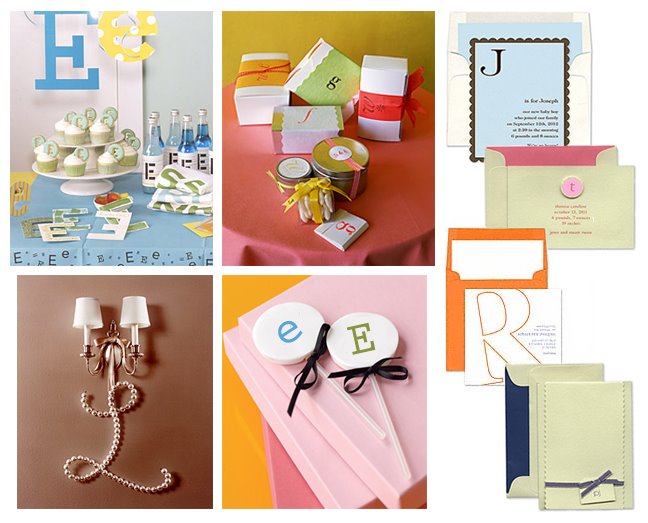


 {images of new Unveiled invitations by Checkerboard}
When choosing wedding invitations, think about what your guest will feel like when they see it in their stack of mail. The envelope should stand out from all the others. Right? The addressing should be special, and when they open the envelope the design and the weight of the paper really makes a big difference. Even if you choose the simplest design, presentation and weight make all the difference. I love designing with our papers. Since I source most of them, because I am inspired by them, our designs begin with really wonderful papers that look and feel really good. When designing, I like to keep the potential couples in mind, thinking about what can make each invitation special and personal.
Keep your guests in mind when you choose your papers and envelopes, your invitation is a little gift to each guest actually. Inviting is a gift in itself. Expressing yourself with your invitation is easy when you start with a company that feels the same way! I am pretty lucky to work for a company that knows how important this is. It makes my job so much more fun.
Keep your guests in mind when you choose your papers and envelopes, your invitation is a little gift to each guest actually. Inviting is a gift in itself. Expressing yourself with your invitation is easy when you start with a company that feels the same way! I am pretty lucky to work for a company that knows how important this is. It makes my job so much more fun.




 Posts